Hippo Inns
Identity + Web Design + Illustration
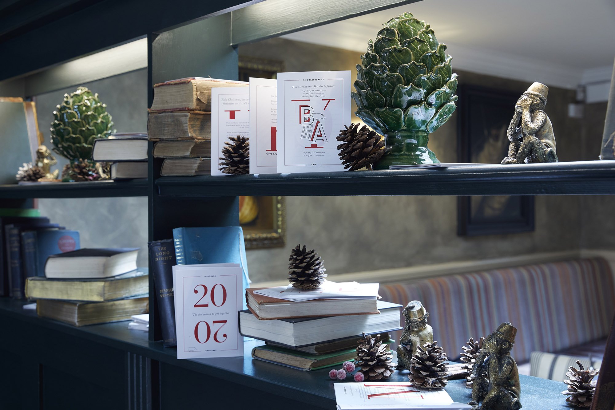
When rebranding Hippo Inns’ 13 London pubs, Bolter took visual inspiration from a toy box. The designs are playful, evoking a library of peculiar things, and uniquely scalable, with a different object for each pub. Like Penguin Books, Hippo Inns become collector’s items; each is distinct, but instantly recognisable, and part of a family with shared values.
Bolter’s branding has been rolled out across fourteen venues (with more in the pipeline), establishing Hippo Inns as the home of London’s best-loved community pub.